Visualization Projects

Design and Development · May 2012 – March 2014

Data and information visualization has been a source of stimulating design challenges (and jobs, for that matter). I've done a handful of projects as part of two data visualization classes and two research intern positions. With such vital examinations of scale, complexity, hierarchy, summary, human vision, and information processing, I've found that visualization is an essential field of study.

Visualization research has yielded principles for so many subject, such as animation, color, saliency, that easily improve any visual presentation. Hence, my study and work in visualization is a constant influence on the way I design interfaces and interactions.

See also: Living Environments Lab, Visual Computing Lab, and my web development work.

Nested Year Timelines

CSE 512: Data Visualization, University of Washington · Feburary 2014 – March 2014

with Michael Beswetherick

Nested Year Timelines (NYT) is a visualization of news articles that shows the range and frequency of a topic’s coverage over time. It uses data from The New York Times Article Search API to display all articles for a topic, grouped into multi-year, multi-month, and single-month timelines.

We created NYT as a way to browse many articles in a compelling and space-efficient manner. It shows a bar graph of articles by year, which reveal a per-month timeline when clicked. Readers can then brush through the articles timeline, with headlines, ledes, images, and links.

A Nested Year Timeline displaying nearly 20,000 articles from the New York Times referencing Barack Obama.
Browse this timeline in your web browser.

Nested Year Timelines lets visitors rapidly explore tens of thousands of Times articles without scrolling through endless pages of search results. Some topics, like Harvard University, San Francisco, or Madison, WI show almost 150 years of articles from the New York Times.

We built NYT as a server and client-side web app, which can show timelines for cached and on-demand topic searches. Try out Nested Year Timelines in your web browser or browse the source code on GitHub, or read our final report (PDF).

Madison Commons Article Explorer

CS 638: Visualization, University of Wisconsin–Madison · May 2012

with Mitch Schwartz

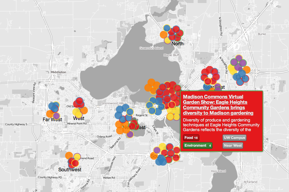
I designed a geographical visualization of articles from Madison Commons as the final project for a class at UW–Madison. This involved implementing our design concepts as an interactive web-based geographic visualization with D3.js and Polymaps. Our design is focused on easy identification of content topics through color and location-based clustering by neighborhood.

The visualization shows clusters of articles, color-coded by their topical content, on a map of Madison, WI. This approach allows readers to explore the rich local content of Madison Commons without losing their place in the world.

The final visualization and the source code are available on GitHub. See also: our final project report (PDF).

A screenshot of the Madison Commons Article Explorer, showing clusters of articles, colored by topic, near their corresponding neighborhood in Madison, WI. View the visualization in your web browser.